With growth comes change, and our beloved Mookah has continued to evolve since it was first established over 11 years ago.
This means, however, that the business you all love today looks very different from the one we first began. Originally called ‘Mookah Studio’, we started out in 2009 as two sisters in a tin shed screen printing our own fabric, and selling our creations at markets far and wide. Over the years, we began to build a community of beautiful followers who adored our designs, and the evolution of Mookah began.

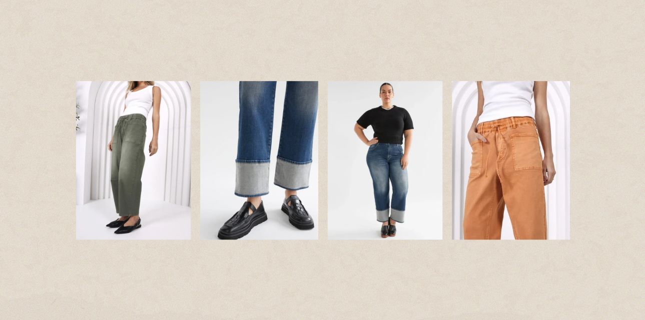
We soon swapped our tin shed for our first bricks and mortar store in Inverloch, with Warragul following soon after, and started to shift our focus from craft in favour of carefully selected curated labels. We continue to pride ourselves on discovering unique items from smaller, independent designers from Australia and New Zealand. Today, you could say our stores are a reflection of our humble beginnings; within them, you’ll find a small market showcasing a variety of ethically and sustainably-made creations, and some of the most highly desirable and quality labels available.
You’re probably wondering where we’re going with this little flashback! As time passed, the meaning behind our original Mookah logo - which related to our lino cutouts and screen printing - became less relevant to the Mookah of today. In order to reflect our growth, we decided it was time for a rebrand, and we are so excited to share our new look with you today!
We were very lucky to work once again with the talented Jayne from Hatch Design Studio, who designed our very first logo, to create this fresh identity for our much-loved brand.
The new ‘Mookah’ has a gorgeous, organic feel and features an illustration of a flowering gum to represent our love of native Australian botanicals. What’s particularly fitting is this particular tree and its striking blossoms can be spotted around Inverloch, where our Mookah flagship store is located.

Not only has Jayne created an entirely new colour palette for us, which includes a soft and smokey ‘Eucalypt’ green paired with a crisp ‘Cotton’ white and blackened ‘Char’ for our main logo, but included secondary colours you’ll see throughout our online presence, including a moody ‘Stormy’ blue, a natural beige reminiscent of ‘French Linen’, rustic, understated ‘Burlap’ and an earthy, yet feminine ‘Blush’ pink. Who knew colours could sound as beautiful as they look?

A linen texture has also been used as a transparent overlay to imply our love of natural textures and fibres, and the new typeface for the word ‘Mookah’ was completely custom-designed for us by Jayne - so our new logo truly is something unique and special.
We absolutely love the visual change Jayne has created for our brand, and we hope that you - our loyal customers and friends - love, connect and resonate with the new direction as much as we do.
So if you spot our new logo and colours when you visit us in-store or online, don’t be confused - it’s the same Mookah you know and love, just with a fresh new look!


Share:
MOOKAH FEATURED ON POSTCARDS
"How Do You Wash A MOKE Jacket?"